MOD Retail Brand System
Turning a brand strategy into a physical experience.
Retail Strategy | Environmental Design | Brand Systems | Localization | Creative Direction
The Opportunity
MOD was expanding rapidly, creating a need for a retail system that could feel unmistakably MOD while still allowing individual stores to feel connected to their communities.
The Idea
Rather than creating identical stores, we developed a flexible brand system that established consistent MOD brand markers while giving each location permission to reflect its neighborhood. In partnership with MOD’s ECD, we developed a scalable store localization strategy that allowed MOD to expand rapidly while maintaining a recognizable brand experience.
The scale
We were able to implement this strategy in over 80+ stores starting in 2021. Saving costs and creating efficiencies by hiring localized muralists and vendors .
Brand Tone
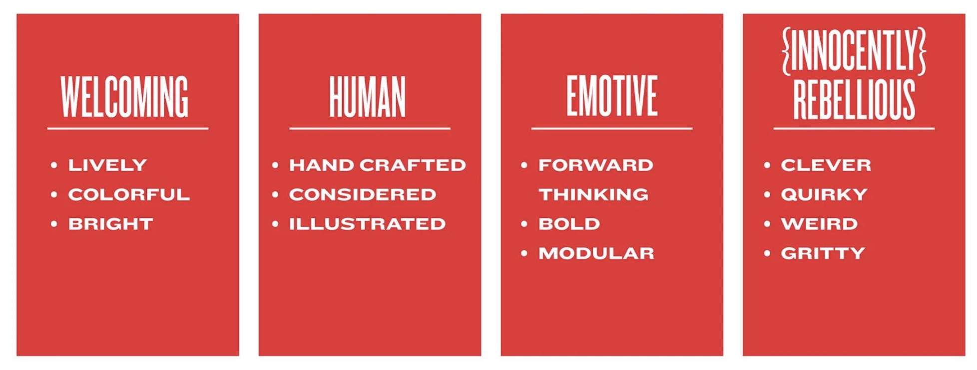
MOD’S Brand Artwork is made up of 3 Elements:
MOD the Brand
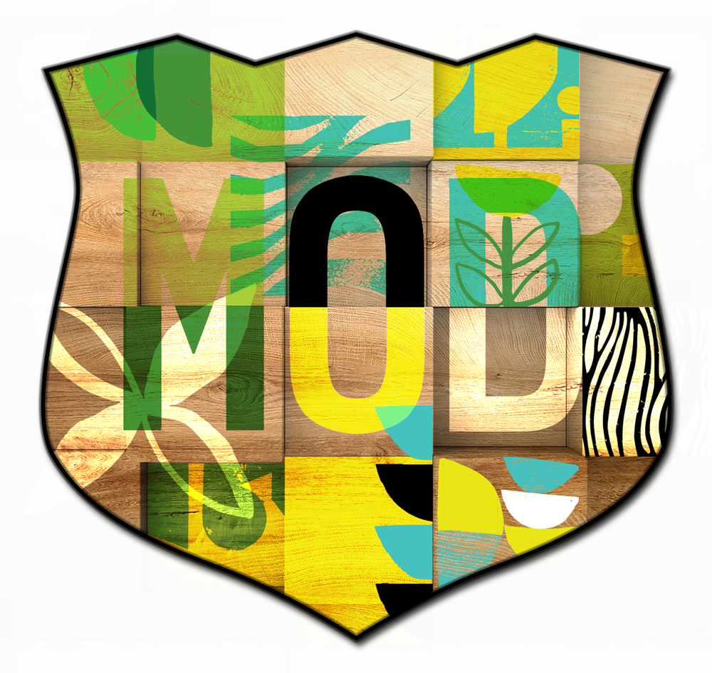
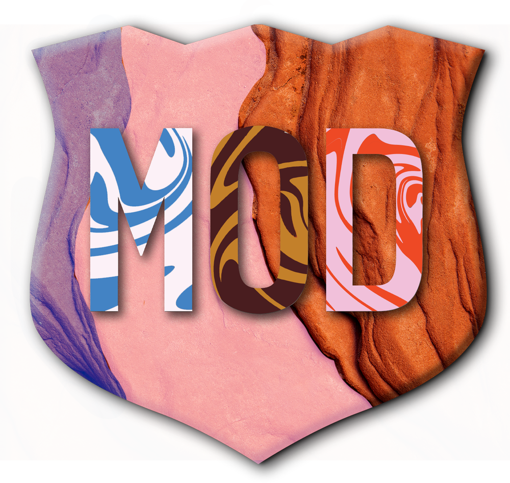
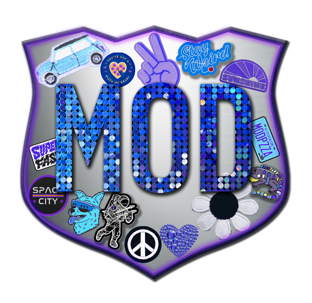
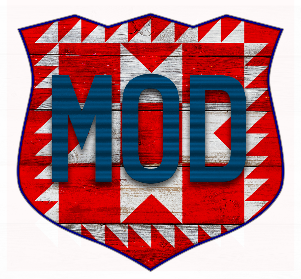
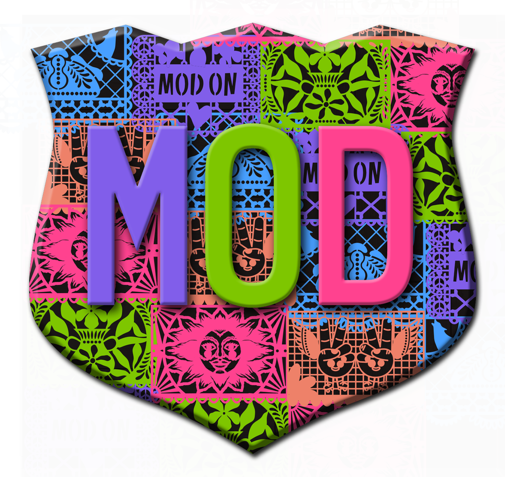
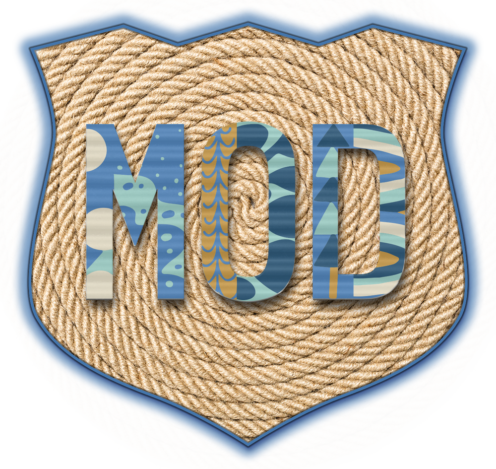
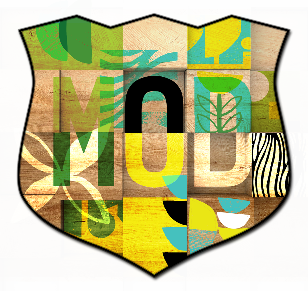
MOD Badge (Dimensional)
MOD Story (Mission Statement)
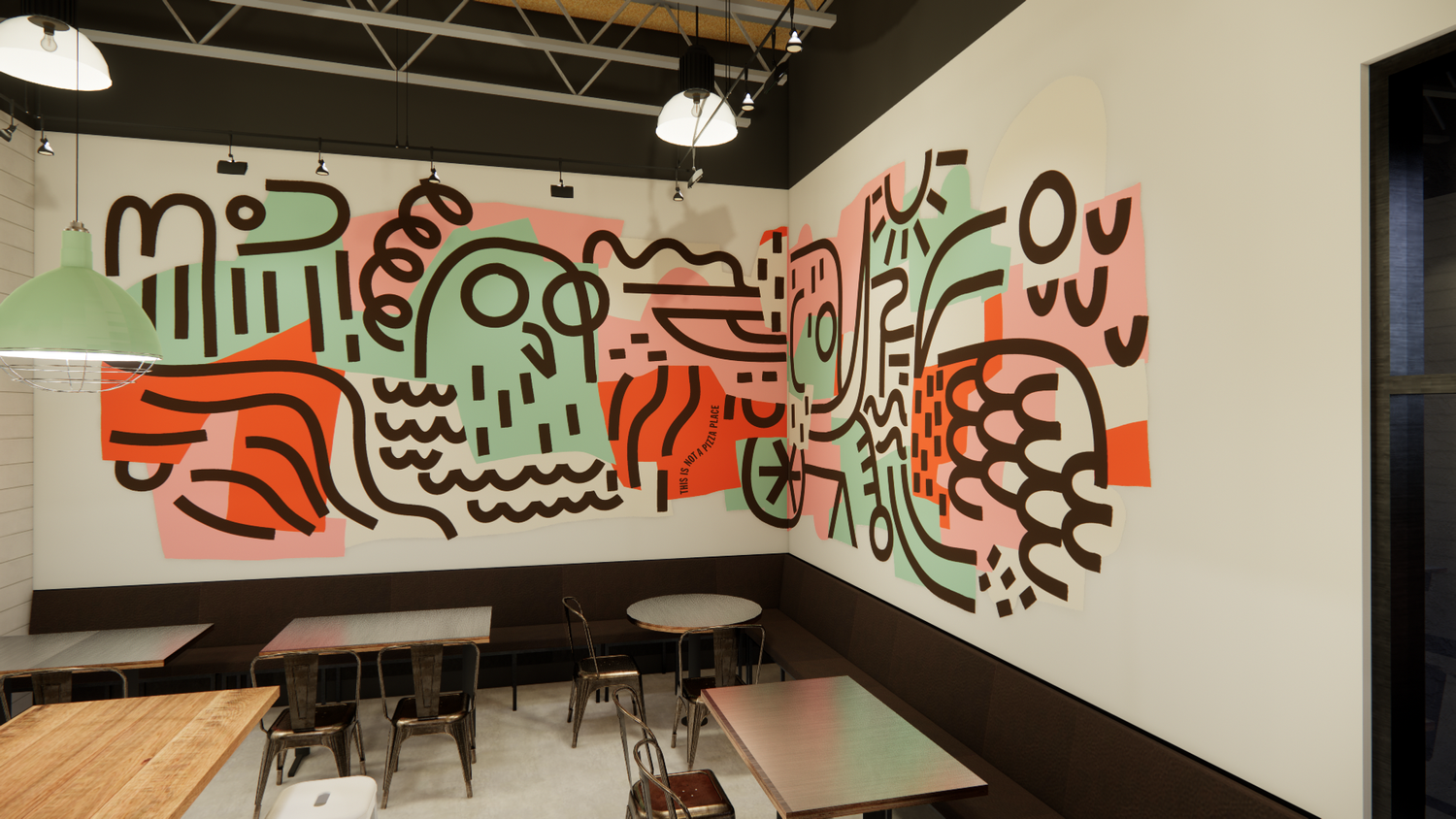
“This is not a Pizza Place” hidden lettering
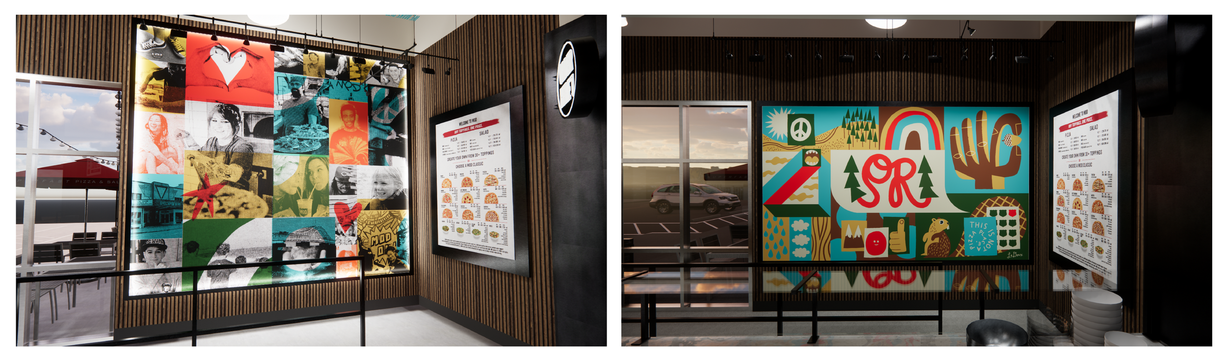
“Wall of Fame” Picture collage of Squad members
Soul of Mod
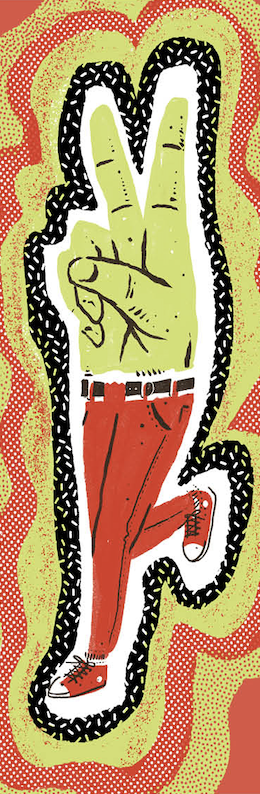
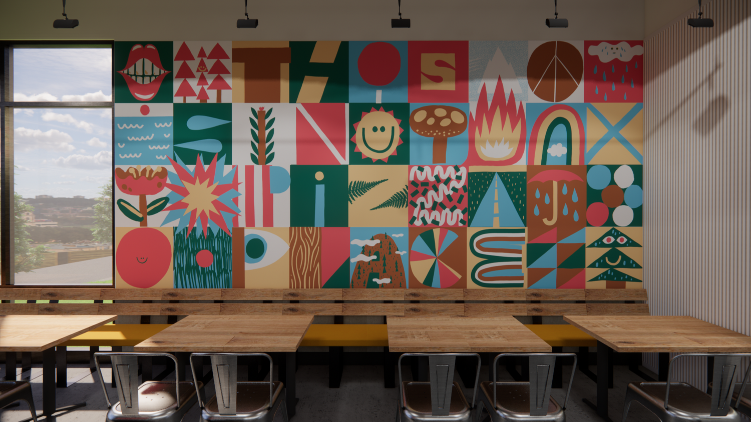
Recurring brand artwork - either murals or posters that represent different symbols of the history of the MOD Brand. SOUL OF MOD pieces are a highly curated collection of consistent brand markers that embody our brand personality. We updated new versions quarterly while preserving them as vintage, iconic personifications of the brand. (Symbols include: Peace Fingers, “MOD Love,” “Flour Power,” Classic Pizza Names, etc.
Hyper Local
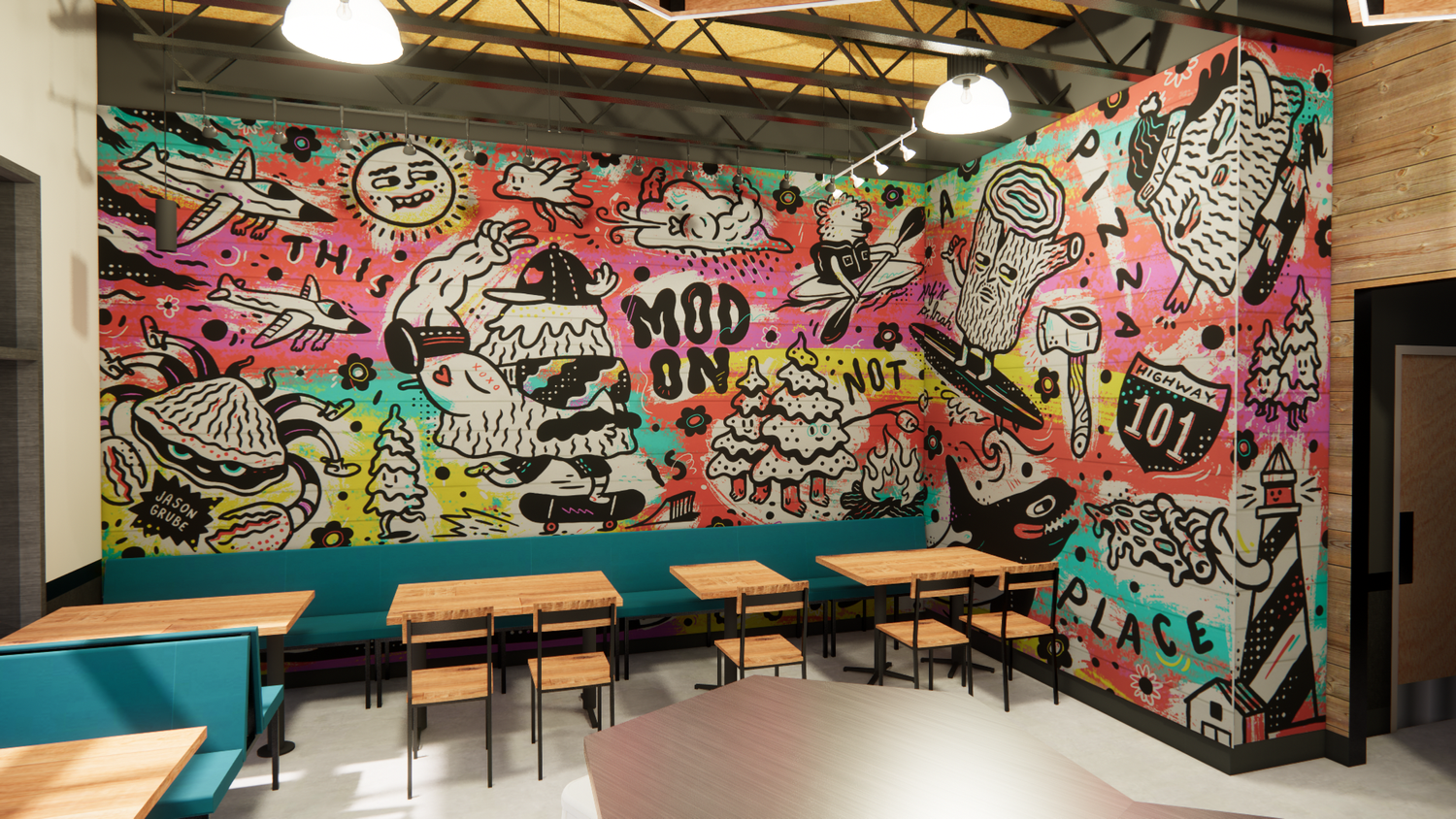
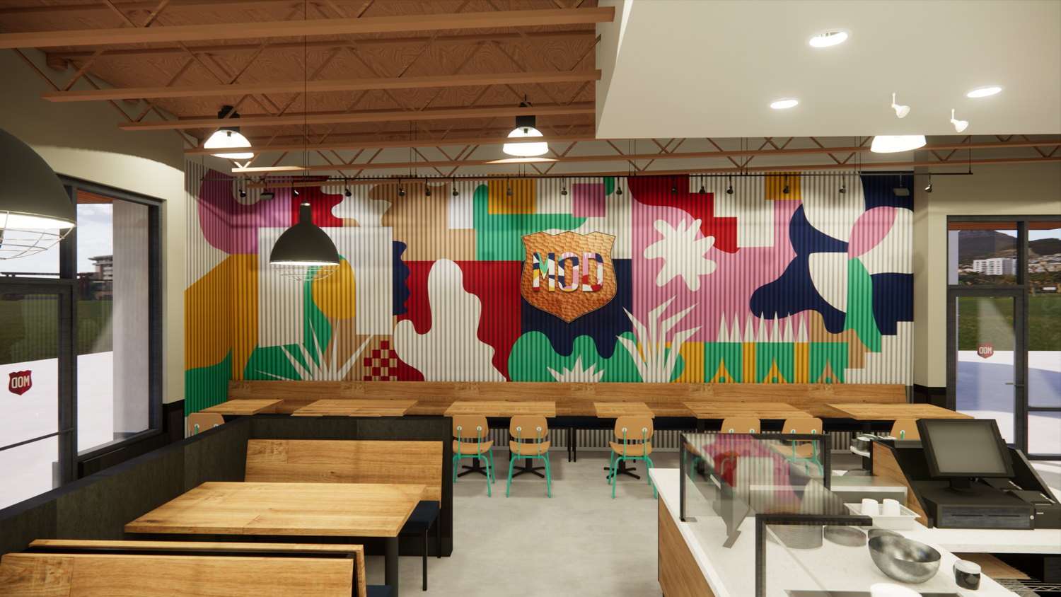
Unique illustrations and painted murals that reflect the local community of each store. This shows up in the paint colors chosen, the subject matter as well as the finishes in store. Extensive research went into each store to make sure local references were thoughtful and accurate to the community.
Store Execution
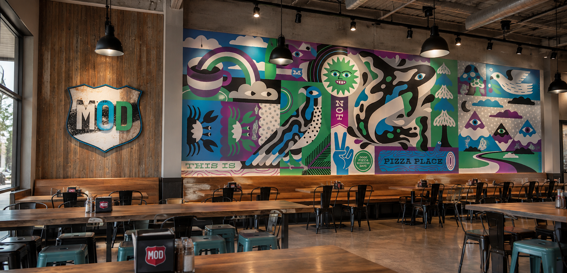
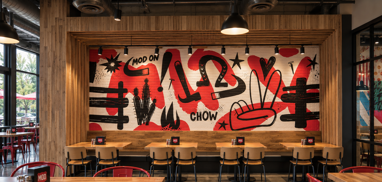
Bellingham, WA
Creative Direction: Annelise Cregger
Illustrator: Jason Grube
Senior Graphic Designer: Mike McKeogh
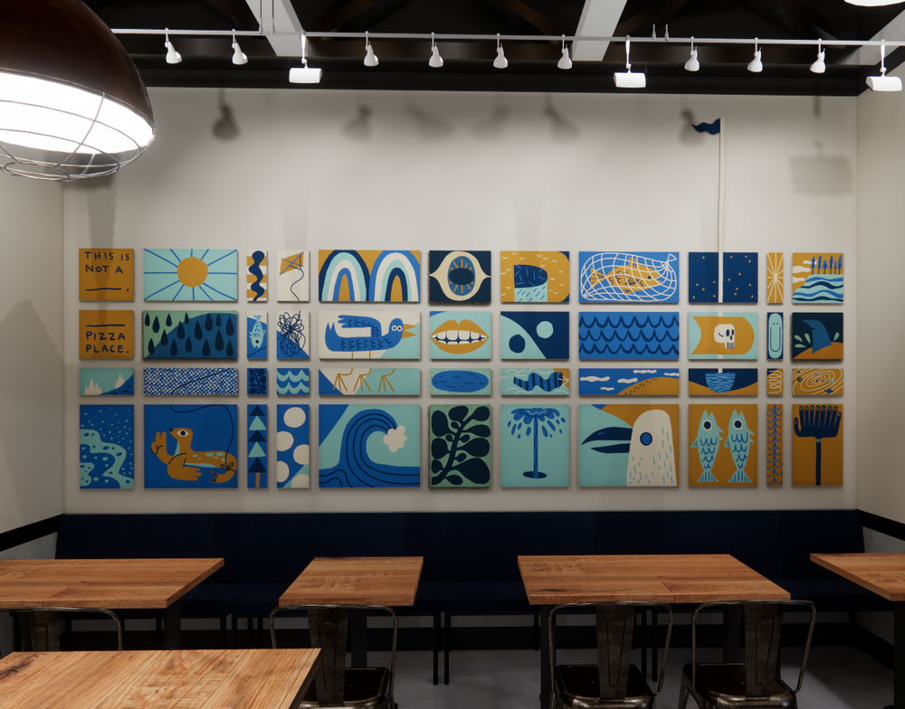
Local Mural is inspired by the nature and animals that live on the coast in Bellingham. Soul of MOD elements are also embedded into each mural (i.e. peace fingers, and “this is not a pizza place”)
The Badge has been painted and faux finished to look like rusted metal with dimensional letters that take color inspiration from the local mural
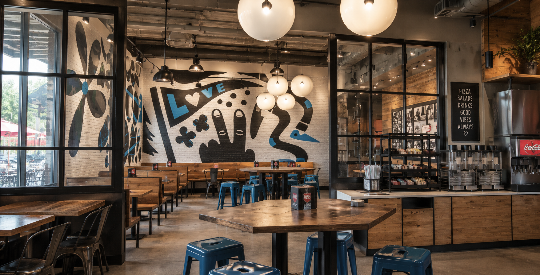
Creative Direction: Annelise Cregger
Illustrator: Mike McKeogh
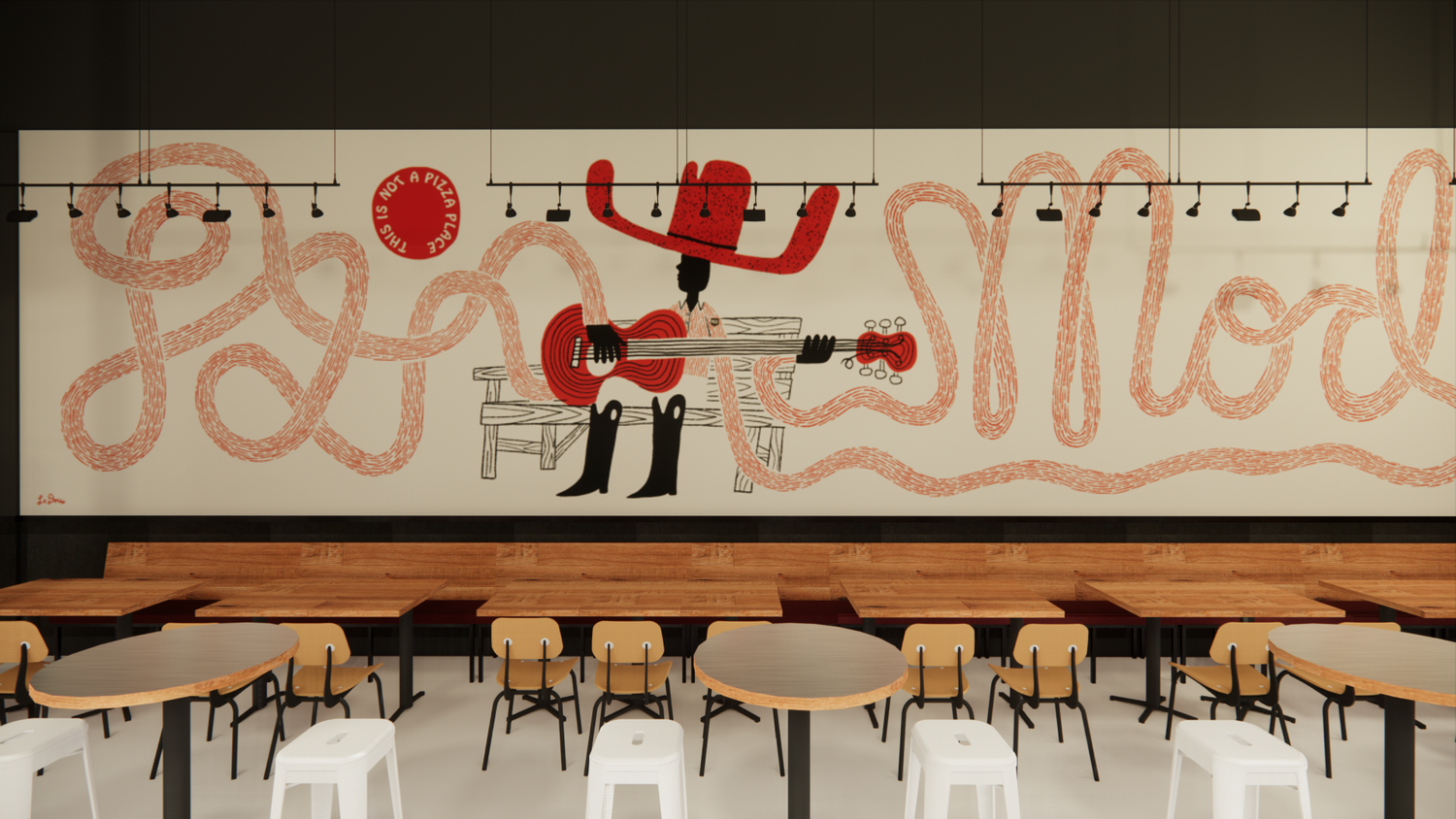
In addition to the local mural, every store has a “Soul of MOD” mural with symbols and messages inspired by the brand. This artwork is adapted and customized for each stores space and color palette.
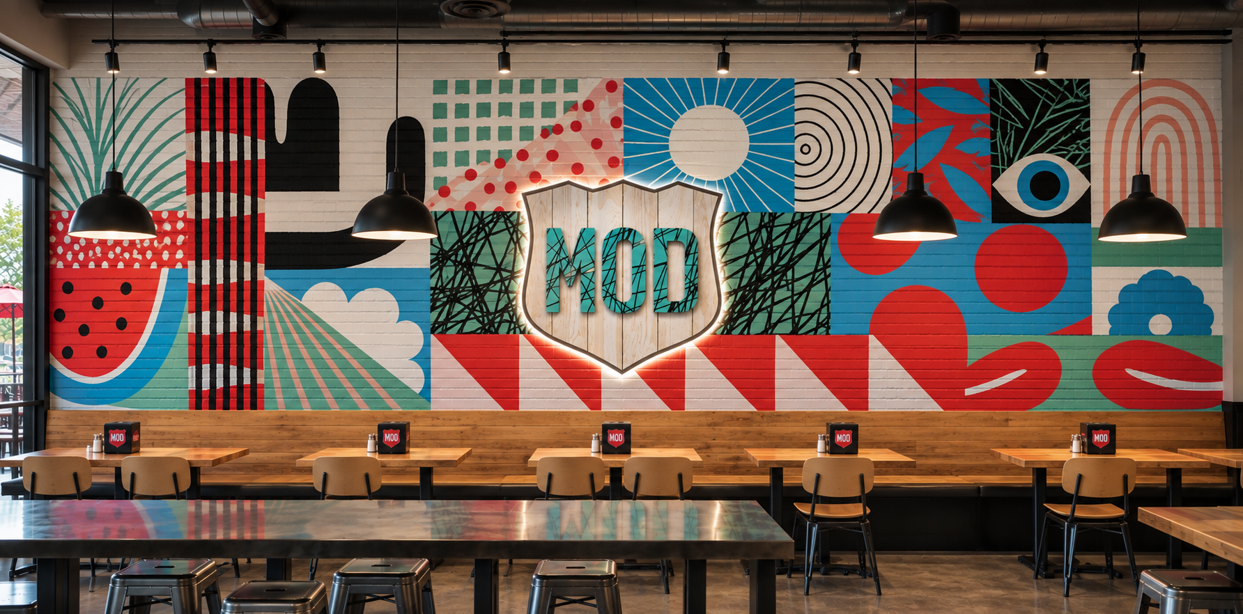
Willis, TX
Creative Direction: Annelise Cregger
Illustrator: Jesse LeDoux
Senior Graphic Designer: Mike McKeogh
Local Mural is inspired by the nature and animals that live on the coast in Bellingham. Soul of MOD elements are also embedded into each mural (i.e. peace fingers, and “this is not a pizza place”)
The Badge has been painted and faux finished to look like rusted metal with dimensional letters that take color inspiration from the local mural
Creative Direction: Annelise Cregger
Illustrator: Mike McKeogh
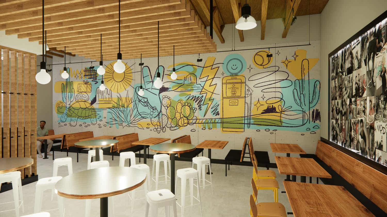
This Texas-inspired“Soul of MOD” mural has a few local elements inspired by the local ranching community, along with symbols and messages from the MOD brand. (i.e. “MOD Love,” “Flour Power,” “Peace Fingers”)
Wall of Fame Photography
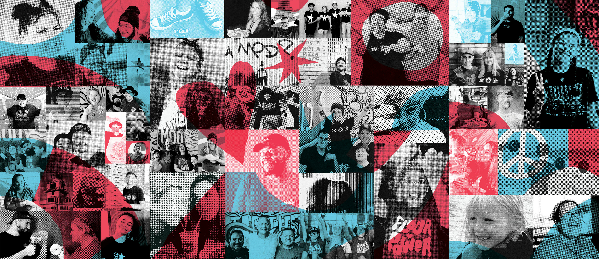
Every MOD Pizza location features a Wall of Fame celebrating the people who make each restaurant part of its local community—the MOD Squad. We saw an opportunity to evolve the photography from a more restrained treatment into something that better captured MOD’s bold, playful spirit. Inspired by the pop-art energy of the 1960s MOD movement that influenced our founders, we introduced a grungier collage aesthetic with halftone textures, bright color overlays, and layered imagery. To make each wall feel connected to its individual restaurant, the color palette was pulled directly from the local mural art, creating a visual relationship between the Squad and the space they call home.
THE CHALLENGE
To update the look and feel of the Squad photography in our Wall of Fame that reflects our localization strategy, our new creative approach to stores and our desire to redefine how the Wall of Fame integrates into MOD. We proposed reimagining the way the Wall of Fame comes to life in a fresh, modern way while preserving the DNA of its original intent.
ART DIRECTION
Designing a system with room to play.
My role was to help define and art direct the visual evolution of the Wall of Fame, establishing a system that could be consistently executed while still allowing each location to have its own personality.
I focused on:
Evolving the photography treatment
Developing the collage and halftone visual language
Establishing color overlay treatments
Creating a relationship between the Wall of Fame and local mural artwork
Defining how photography, texture, color, and typography interacted
Maintaining a recognizable MOD expression across locations
The goal wasn't to create a perfectly repeatable wall.
It was to create a repeatable creative framework with enough flexibility to feel different from store to store.
THE RESULT
The Wall of Fame evolved from a restrained photographic treatment into a more energetic and expressive piece of the MOD retail environment.
The combination of black-and-white photography, halftone textures, collage, and bright color overlays created a stronger visual connection to MOD's personality, while matching each palette to its local mural helped the experience feel rooted in its individual location.
What started as a standardized brand element became something more dynamic:
A visual system that could belong to MOD—and belong to the neighborhood at the same time.
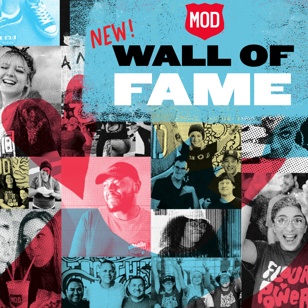
Pop Art inspired filters

Store Execution

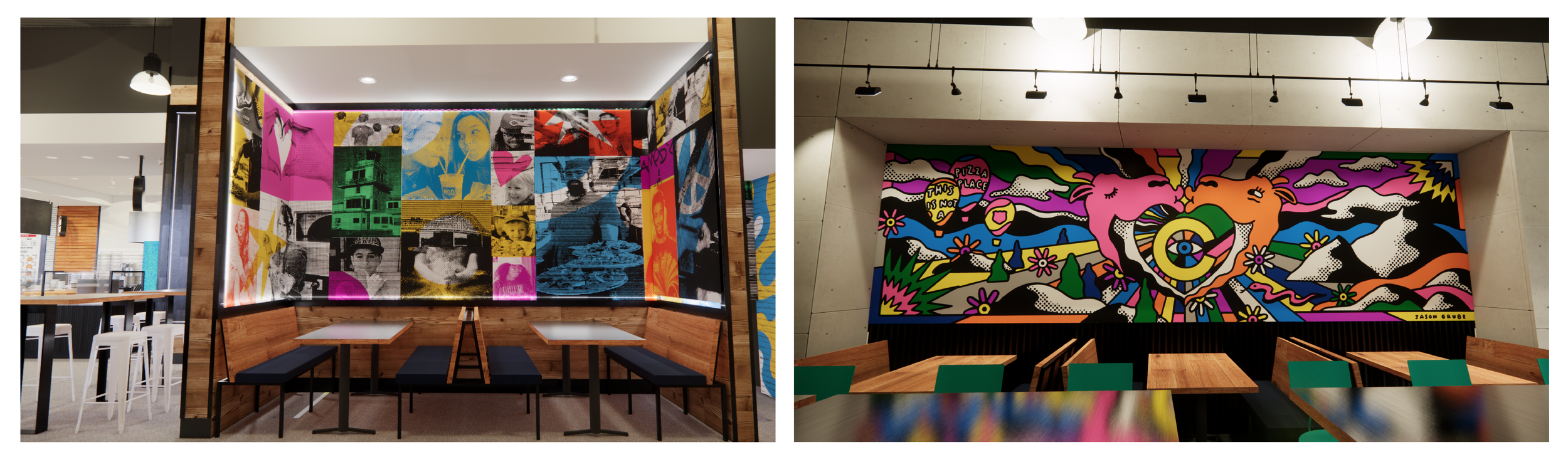
More Murals
Dimensional Badges